Blogger Tips
Blogger is a user-friendly service that provides a lot of really attractive looking default templates for those just starting out. Default templates come in handy, but the nice things about owning your own blog is that you have the chance to add your own personal touch. As a matter of fact, templates aren't made to restrict your freedom of design, but instead they're there to provide you a foundation to build from. With every default template available on Blogger, you can make changes to fit your style.
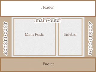
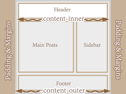
One of the most common requests out of the Blogger community when making alterations is how to change the look of some of the key sections like headers, navigation, and footers. Initially, these items are designed to fit within just 1/3 of the page, surrounded by padding and margins on either side. These margins are used to give the page a slim fitting appearance, but could also cause your content to look compressed.


Now find this part:
- Where To Find Free Blogger Backgrounds And Textures
Blogger is a fantastic tool for amateur and professional writers that have a passion for publishing online content. Unlike WordPress or hosting companies that require you to design your site before ever getting started, Blogger is a ready to go service...
- How To Center The Blogger Header Image
The header of a website is what distinguishes your blog; it's your identity or digital fingerprint. Whenever a visitor accesses your blog for the first time, the header is one major aspect that is used to determine who you are and the type of content...
- Horizontal Menu With Sub-tabs In Two Columns For Blogger
This is a very nice horizontal menu in which its sub-tabs are displayed in two columns and is also made with CSS, without any scripts. The "advantage" so to speak, is that the sub-tabs when arranged in two columns are not very long, so it will be neat...
- Create Horizontal Navigation Menu With Drop Down Submenus Using Css
The following drop down menu is made only with CSS, is a horizontal menu with sub-tabs and the right side has a rounded search. A menu is handy for those who do not require complex menus or prefer not to use one that requires scripts and/or too many images,...
- How To Hide Blogger Sidebar To Display Adsense For Search Results
When visitors are searching for content on your blog, you have three options to display the search results: opening the results in the same window, in a new window or within your own site using an iframe. The best option would be, however, to display...
Blogger Tips
Make Blogger Header, Navigation and Footer Full Width
Blogger is a user-friendly service that provides a lot of really attractive looking default templates for those just starting out. Default templates come in handy, but the nice things about owning your own blog is that you have the chance to add your own personal touch. As a matter of fact, templates aren't made to restrict your freedom of design, but instead they're there to provide you a foundation to build from. With every default template available on Blogger, you can make changes to fit your style.
One of the most common requests out of the Blogger community when making alterations is how to change the look of some of the key sections like headers, navigation, and footers. Initially, these items are designed to fit within just 1/3 of the page, surrounded by padding and margins on either side. These margins are used to give the page a slim fitting appearance, but could also cause your content to look compressed.
Important: Backup your Template
Making the changes to a full screen Blogger navigation, footer, or header can be done and won't take you much time. Before you can make any changes, you should save extra copies of the template .xml file in case anything goes wrong. That way, if you don't like it or it doesn't come out looking like it should, you can reuse the contents of the original file to restore your blog to working condition.
Demo
Hover your mouse over the image to see a before and after example:
How to Make Header, Navigation and Footer Full Width in Blogger
Step #1: Access Your CSS File
If you've never opened up your CSS file before, log in to your Blogger account, select your blog and navigate to Template > Edit HTML. This will bring up the code of your template containing all your blog's internal files in one place.Step #2: Modify the Background
Click anywhere inside the code area > press CTRL + F keys and type the following line > hit Enter to find it (stop at the first occurrence of it):body {Just below body { you should see some lines that will look like this:
body {Where you see the highlighted line above in the code, remove the line and replace it with:
font: $(body.font);
color: $(body.text.color);
background: $(body.background);
padding: 0 $(content.shadow.spread) $(content.shadow.spread) $(content.shadow.spread);
$(body.background.override)
}
padding: 0px;Different templates will have minor variations, but you should still be able to find these lines within every template.
Step #3: Change the Content Section
Next, search using the CTRL+F keys for this part:.content-inner {Just below it, you will see this line:
.content-inner {Remove the line in red and replace it with:
padding: $(content.padding) $(content.padding.horizontal);
}
padding: 0px;This will remove any of the padding around the inner content, so it won't leave any room on both sides.
Now find this part:
$(content.background.color.selector){Just below it you will see this line:
$(content.background.color.selector){Replace the line in red with:
background-color: $(content.background.color);
}
background-color: $(body.background);Finally, search for this tag:
]]></b:skin>And just above it, add this CSS:
.main-outer {
background: $(content.background.color);
}
Step #4: Make the Content Outer Full Width
Content is displayed differently between browsers, so you'll next want to fix this so that it alters the width across the board. This code can be found searching for:.content-outer, .content-fauxcolumn-outer, .region-inner {And just below it you will see the following lines:
.content-outer, .content-fauxcolumn-outer, .region-inner {Delete the line in red and replace that line with:
min-width: $(content.width);
max-width: $(content.width);
_width: $(content.width);
}
max-width: 100%;
Step #5: Finish It Up
Now you have just two more lines you need to change. Look for:</b:template-skin>And click on the right arrow to expand the styles. Note: you will need to search for </b:template-skin> tag again, and just before it you'll see these symbols highlighted in yellow:
]]>Above this ]]></b:template-skin> section of code, add the following:
</b:template-skin>
.main-outer {Then run a search for:
max-width: $(content.width);
margin: 0 auto;
}
]]></b:skin>Add these lines of code just before/above it:
.tabs-inner {Save the template and exit out of the editor.
padding: 0px;
}
.section {
margin: 0px;
}
.header-inner .widget {
margin: 0px;
}
Finished!
Following along with this tutorial won't affect or alter the pictures you are using on the blog, just the design of the content area. If you have a logo that stretches across the screen and fits perfectly for 1/3 page header, you will need to resize and re-upload this content so that it is able to work with the new adjustments.- Where To Find Free Blogger Backgrounds And Textures
Blogger is a fantastic tool for amateur and professional writers that have a passion for publishing online content. Unlike WordPress or hosting companies that require you to design your site before ever getting started, Blogger is a ready to go service...
- How To Center The Blogger Header Image
The header of a website is what distinguishes your blog; it's your identity or digital fingerprint. Whenever a visitor accesses your blog for the first time, the header is one major aspect that is used to determine who you are and the type of content...
- Horizontal Menu With Sub-tabs In Two Columns For Blogger
This is a very nice horizontal menu in which its sub-tabs are displayed in two columns and is also made with CSS, without any scripts. The "advantage" so to speak, is that the sub-tabs when arranged in two columns are not very long, so it will be neat...
- Create Horizontal Navigation Menu With Drop Down Submenus Using Css
The following drop down menu is made only with CSS, is a horizontal menu with sub-tabs and the right side has a rounded search. A menu is handy for those who do not require complex menus or prefer not to use one that requires scripts and/or too many images,...
- How To Hide Blogger Sidebar To Display Adsense For Search Results
When visitors are searching for content on your blog, you have three options to display the search results: opening the results in the same window, in a new window or within your own site using an iframe. The best option would be, however, to display...
