Blogger Tips
How a website's content is displayed can spell the difference between being popular and obscure. Anything that looks chaotic or hardly readable is never going to be anyone's favorite. This is why content must be displayed in an organized, easy to follow and straightforward manner. Nothing works better than a structured grid, in this case.
Posts listed in grid view provide an excellent viewing experience for both the blogger or website owner and the visitors. This is especially true if the grid comes with images that would play with a person's visual inclination. What is great about grids is the seamless and smooth layout, complemented with a structured yet simple architecture. This makes it easier to navigate through a blog archive or product page. The style also enables a website owner to present posts in a more artistic and informative manner, without delving into the details. Suffice to say that a grid view demands creativity to be effortlessly mixed with functionality.
How views can be switched depends on a number of changes in a blog's codes. Some are fairly easy to implement, while others can be a little complex. Not to worry, as there are guides that will be provided. Grid styles also come in huge varieties, with each one designed to cater to a specific audience. Now, are you ready to go on the grid?
Although changes to the CSS codes have to be made to implement the grid style view and make it compatible with a blog's template, all the work will be worth it once it is up and running.
Important:
Before anything make sure that you backup your Blogger template! If have encounter any problems with your edits, you can revert the template back to its previous condition by restoring it from your backup. For this, go to 'Template' in the left menu > click on the 'Backup/Restore' button in the upper right corner and press the 'Download Full Template' button - choose where you want to save the file on your computer and click the 'Save' button.
Now we can safely proceed with editing our Blogger template. If you run into problems, just revert back to your saved template.
Step 2. Go to "Template" located on the left side of the screen and press the "Edit HTML" button.
Step 3. Click anywhere inside the code area and press the CTRL+F keys to open the search box, then type the following tag inside the box (hit Enter to find it):
Step 7. Now choose one of the styles below, copy the code provided and paste it just above the </head> tag:

Please note that the masonry layout might not work if you have a customized template, also older posts will appear vertically (from top to bottom) instead of left to right.
Step 8. Click "Preview" and if everything looks fine, press the "Save Template" button.
- 5 Best Popular Posts Widgets For Blogger
If you're using Blogger as the platform for your personal or business blog, you're probably looking for ways to customize it and make it your own. This way, you'll make your webpages unique and eye-catching and ensure they'll stand out...
- Responsive Css Timeline With 3d Effect For Blogger
Here's another amazing way to display our Blogger posts. By applying the following Responsive CSS Timeline View with 3D Effect on Blogger Posts, we will have a responsive timeline-like structure of the most recent posts and their thumbnails, along...
- Display Blogger Posts In Grid View With Thumbnails
Grid View with Thumbnails is a script for self-hosted Blogger blogs which will display blog posts as a thumbnail grid of images in homepage and archive pages. Instead of sending your blog visitors to a page that displays all the posts in full length with...
- How To Create Magazine Style With Post Summaries And Thumbnails On Blogger
The magazine or newspaper style templates are those that display the posts summaries in the homepage by stacking the columns on top of each other. This kind of templates is very popular nowadays, and whether it is a news or technology blog, everyone needs...
- Auto Read More With Thumbnail For Blogger/blogspot Posts
How to make posts in the blog homepage to be displayed with an automatic "read more" button and a thumbnail.To be more specific, this will show the title of the post, then a short summary with a number of characters and a thumbnail, that will be the thumbnail...
Blogger Tips
Add Masonry, Grid Layouts to Blogger Posts with CSS and Javascript
How a website's content is displayed can spell the difference between being popular and obscure. Anything that looks chaotic or hardly readable is never going to be anyone's favorite. This is why content must be displayed in an organized, easy to follow and straightforward manner. Nothing works better than a structured grid, in this case.
Posts listed in grid view provide an excellent viewing experience for both the blogger or website owner and the visitors. This is especially true if the grid comes with images that would play with a person's visual inclination. What is great about grids is the seamless and smooth layout, complemented with a structured yet simple architecture. This makes it easier to navigate through a blog archive or product page. The style also enables a website owner to present posts in a more artistic and informative manner, without delving into the details. Suffice to say that a grid view demands creativity to be effortlessly mixed with functionality.
How views can be switched depends on a number of changes in a blog's codes. Some are fairly easy to implement, while others can be a little complex. Not to worry, as there are guides that will be provided. Grid styles also come in huge varieties, with each one designed to cater to a specific audience. Now, are you ready to go on the grid?
Features
What features can you expect from a grid style post in Blogger?
- All the posts will follow the grid style when switching to grid view.
- While the codes are being customized, the posts are left untouched. Their length, however, could be changed accordingly.
- Auto Read More will be applied on all posts.
- Thumbnails are automatically added based on the first picture found in each post.
- Code is secure and is used across the board. In fact, 99% of bloggers are using a similar code to enable grid style posts in blogger.
What are the benefits of grid style?
- Quick loading time of posts. Since only the snippets are loaded in certain pages, or a thumbnail and a caption, pulling up a blog archive would be quicker. When loading time is decreased, user experience is greatly enhanced.
- Professional-looking blog. Without the chaos and concerns on readability, a website can look really clean and professional. Combined with the right colors and images, it can also leave a visual impact.
- Improved website ranking. Because visitors have to click in order to view the rest of the post, page views of a site will significantly increase. This makes for a better SEO strategy.
Although changes to the CSS codes have to be made to implement the grid style view and make it compatible with a blog's template, all the work will be worth it once it is up and running.
Important:
Before anything make sure that you backup your Blogger template! If have encounter any problems with your edits, you can revert the template back to its previous condition by restoring it from your backup. For this, go to 'Template' in the left menu > click on the 'Backup/Restore' button in the upper right corner and press the 'Download Full Template' button - choose where you want to save the file on your computer and click the 'Save' button.
Now we can safely proceed with editing our Blogger template. If you run into problems, just revert back to your saved template.
How to Create Masonry, Grid Style Posts in Blogger
Step 1. Log into your Blogger dashboard and click on the blog where you want to apply the grid style.Step 2. Go to "Template" located on the left side of the screen and press the "Edit HTML" button.
Step 3. Click anywhere inside the code area and press the CTRL+F keys to open the search box, then type the following tag inside the box (hit Enter to find it):
</head>Step 4. Now copy the script below and paste it just before the </head> tag:
<script type='text/javascript'>Step 5. Find the following code snippet using CTRL+F or Command + F:
posts_no_thumb_sum = 100;
posts_thumb_sum = 100;
</script>
<script type='text/javascript'>
//<![CDATA[
function removeHtmlTag(strx,chop){
if(strx.indexOf("<")!=-1)
{
var s = strx.split("<");
for(var i=0;i<s.length;i++){
if(s[i].indexOf(">")!=-1){
s[i] = s[i].substring(s[i].indexOf(">")+1,s[i].length);
}
}
strx = s.join("");
}
chop = (chop < strx.length-1) ? chop : strx.length-2;
while(strx.charAt(chop-1)!=' ' && strx.indexOf(' ',chop)!=-1) chop++;
strx = strx.substring(0,chop-1);
return strx+'...';
}
function createSummaryAndThumb(pID, pURL, pTITLE){
var div = document.getElementById(pID);
var imgtag = "";
var img = div.getElementsByTagName("img");
var summ = posts_no_thumb_sum;
if(img.length>=1) {
imgtag = '<span class="posts-thumb" ><a href="'+ pURL +'"><img src="'+img[0].src+'" /></a></span>';
summ = posts_thumb_sum;
}
else {
imgtag = '<span class="posts-thumb" ><a href="'+ pURL +'" title="'+ pTITLE+'"><img src="http://2.bp.blogspot.com/-Gbn3dT1R9Yo/VPXSJ8lih_I/AAAAAAAALDQ/24wFWdfFvu4/s1600/sorry-image-not-available.png" /></a></span>';
summ = posts_thumb_sum;
}
var summary = imgtag + '<a href="'+ pURL +'"><div class="post-summary-text">' + removeHtmlTag(div.innerHTML,summ) + '</div></a>';
div.innerHTML = summary;
}
//]]>
</script>
<data:post.body/>Step 6. After pressing the "Enter" key on your keyboard, you may find three occurrences of the above code, replace only the second and the third one with this code below:
<b:if cond='data:blog.pageType != "static_page"'>
<b:if cond='data:blog.pageType != "item"'>
<div expr:id='"summary" + data:post.id'>
<data:post.body/>
</div>
<script type='text/javascript'>createSummaryAndThumb("summary<data:post.id/>","<data:post.url/>");</script>
<b:if cond='data:post.allowComments'>
<a class='comment-bubble' expr:href='data:post.addCommentUrl' expr:onclick='data:post.addCommentOnclick'>
<data:post.numComments/>
</a>
</b:if>
</b:if>
</b:if>
<b:if cond='data:blog.pageType == "item"'>
<data:post.body/>
</b:if>
<b:if cond='data:blog.pageType == "static_page"'>
<data:post.body/>
</b:if>
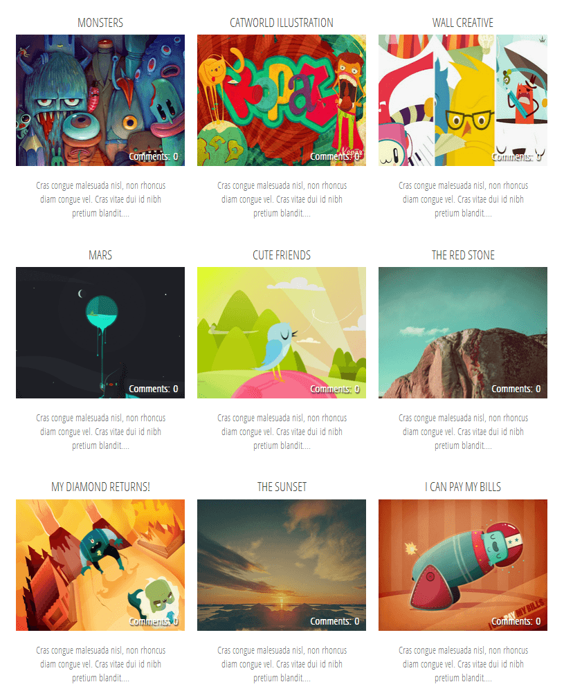
Step 7. Now choose one of the styles below, copy the code provided and paste it just above the </head> tag:
Simple Grid Design

<b:if cond='data:blog.pageType != "static_page"'>
<b:if cond='data:blog.pageType!= "item"'>
<style>
#blog-pager {
clear:both;
}
.post {
height: auto;
width:30.8%;
overflow: hidden;
display:inline-block;
text-decoration:none;
float:left;
margin:0 1.1% 2%;
padding: 0px !important;
}
h3.post-title a {
font-size:75%;
font-family: 'Open Sans Condensed', sans-serif;
text-transform:uppercase;
padding:0;
color:#444;
}
h3.post-title {
height: 26px;
text-align:center;
width:100%;
margin:0!important;
padding-bottom: 4%;
}
.date-header {
display: none;
}
.post-body a {
text-decoration: none;
}
.posts-thumb {
width:100%!important;
height:190px!important;
overflow:hidden;
clear:both;
}
.post-body img {
display:block;
width:100%!important;
height:auto!important;
max-width:800px!important;
max-height:400px!important;
min-width:190px!important;
min-height:190px!important;
border:none;
outline:none;
position:relative;
margin: 0px;
padding:0;
}
.post-summary-text {
color:#777;
font-size:100%!important;
font-family: 'Open Sans Condensed', sans-serif;
text-align:center;
clear:both;
overflow:hidden;
margin:5px 0 0;
padding:7% 10%;
}
a.comment-bubble {
color:#fff;
text-decoration:none;
font-size:100%;
font-weight: bold;
right:10px;
position:absolute;
top:165px;
text-shadow:1px 2px 1px #333;
font-family: 'Open Sans Condensed', sans-serif;
}
a.comment-bubble:before {
content: "Comments: ";
}
.post-header,.post-footer {
display:none;
}
</style></b:if></b:if>
<link href='http://fonts.googleapis.com/css?family=Open+Sans+Condensed:300' rel='stylesheet' type='text/css'/>
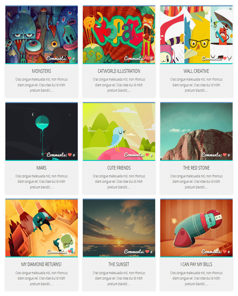
Grid Layout with Post Summary and Thumbnail

Demo
<b:if cond='data:blog.pageType != "static_page"'>
<b:if cond='data:blog.pageType!= "item"'>
<style>
#blog-pager {
clear:both;
}
.post {
height:auto;
width:31%;
display:inline-block;
text-decoration:none;
float:left;
margin:0 1.1% 2%;
padding:0!important;
}
h3.post-title a {
font-size:75%;
font-family: 'Open Sans Condensed', sans-serif;
text-transform:uppercase;
color:#111;
padding:0;
}
h3.post-title {
text-align:center;
height:22px;
position:absolute;
bottom:23%;
width:100%;
z-index:101;
overflow:hidden;
margin:0!important;
padding:10px 0;
}
.date-header {
visibility:hidden;
height:0!important;
width:0!important;
margin:0!important;
padding:0!important;
}
.posts-thumb {
width:100%!important;
height:190px!important;
overflow:hidden;
clear:both;
border-bottom:3px solid #00C8BD;
border-top:3px solid #558ABB;
}
.posts-thumb:hover {
border-top:3px solid #FF664E;
border-bottom:3px solid #FEBE36;
}
.post-body {
border-radius:2px;
box-shadow:0 0 6px 1px rgba(0,0,0,0.1);
position:relative;
height:auto;
}
.post-body a {
text-decoration: none;
}
.post-body img {
display:block;
width:100%!important;
height:auto!important;
max-width:800px!important;
max-height:400px!important;
min-width:190px!important;
min-height:190px!important;
border:none;
outline:none;
position:relative;
margin: 0px;
padding:0;
}
.post-summary-text {
color:#555;
background:#f5f5f5 url(http://1.bp.blogspot.com/-rh-PYvqjzSs/VPTARkPOSVI/AAAAAAAALC4/GyFFEnl2TO8/s1600/blueprint.png);
font-size:100%!important;
font-family: 'Open Sans Condensed', sans-serif;
text-align:center;
clear:both;
overflow:hidden;
margin:5px 0 0;
padding:17% 10% 6%;
}
a.comment-bubble {
color:#fff;
text-decoration:none;
font-size:110%;
right:10px;
position:absolute;
top:165px;
text-shadow:1px 2px 1px #333;
font-family: 'Pacifico', cursive;
}
a.comment-bubble:before {
content: "Comments: " url(http://4.bp.blogspot.com/-t1i_svebif4/VPMpZqPrKzI/AAAAAAAALAg/TRJ2Un238Gs/s1600/heart-active.png);
}
.post-header,.post-footer {
display:none;
}
</style></b:if></b:if>
<link href='http://fonts.googleapis.com/css?family=Open+Sans+Condensed:300' rel='stylesheet' type='text/css'/>
<link href='http://fonts.googleapis.com/css?family=Pacifico' rel='stylesheet' type='text/css'/>
Grid Layout with Text Snippet on Hover

Demo
<b:if cond='data:blog.pageType != "static_page"'>
<b:if cond='data:blog.pageType!= "item"'>
<style>
#blog-pager {
clear:both;
}
.post {
height:auto;
width:31%;
display:inline-block;
text-decoration:none;
float:left;
margin:0 1.1% 2%;
padding:0!important;
}
h3.post-title a {
font-size:95%;
font-family: 'Open Sans Condensed', sans-serif;
text-transform:uppercase;
color:#fff;
padding:0;
text-shadow: 2px 2px 3px #222;
}
h3.post-title {
height: 22px;
text-align:center;
position:absolute;
top:1%;
width:100%;
z-index:101;
overflow:hidden;
margin:0!important;
padding:10px 0;
}
.date-header {
visibility:hidden;
height:0!important;
width:0!important;
margin:0!important;
padding:0!important;
}
.posts-thumb {
width:100%!important;
height:190px!important;
overflow:hidden;
clear:both;
}
.post-body {
border-radius:2px;
box-shadow:0 5px 4px 1px rgba(0,0,0,0.1);
position:relative;
overflow: hidden;
}
.post-body a {
text-decoration: none;
}
.post-body img {
display:block;
width:100%!important;
height:auto!important;
max-width:800px!important;
max-height:400px!important;
min-width:190px!important;
min-height:190px!important;
border:none;
outline:none;
position:relative;
margin: 0px;
padding:0;
}
.post-summary-text {
cursor: pointer;
background-color: rgba(44, 77, 163, 0.8);
color:#fff;
font-size:120%!important;
font-family: 'Open Sans Condensed', sans-serif;
clear:both;
overflow:hidden;
padding:25% 10% 0%;
left: 0;
position: absolute;
text-align: center;
vertical-align: bottom;
text-shadow: 1px 1px 0 rgba(0, 0, 0, 0.1);
top: 0;
transform: scale(1);
opacity: 0;
z-index: 10;
height: 100%;
transition: all 300ms ease-out 0s;
}
.post-summary-text:hover {
opacity: 1;
}
a.comment-bubble {
color:#fff;
text-decoration:none;
font-size:100%;
width: 100%;
text-align: center;
position:absolute;
top:165px;
left: 0px;
text-shadow:1px 2px 1px #333;
font-family: 'Pacifico', cursive;
z-index: 122;
}
a.comment-bubble:before {
content: "Comments: ";
}
.post-header,.post-footer {
display:none;
}
</style></b:if></b:if>
<link href='http://fonts.googleapis.com/css?family=Open+Sans+Condensed:300' rel='stylesheet' type='text/css'/>
<link href='http://fonts.googleapis.com/css?family=Pacifico' rel='stylesheet' type='text/css'/>
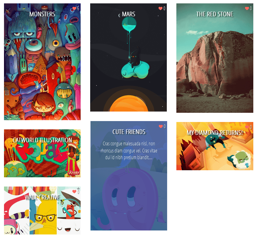
Masonry Layout (Pinterest Like Grid)

DEMO
<b:if cond='data:blog.pageType != "static_page"'>
<b:if cond='data:blog.pageType!= "item"'>
<style>
#blog-pager {
clear: both;
position: absolute;
bottom: 0px;
left: 0px;
}
.blog-feeds {
display: none;
}
.post {
height: auto;
width: 100%;
padding: 0px !important;
margin: 0px 0px 30px;
display: inline-block;
text-decoration: none;
}
h3.post-title a{
font-size: 95%;
font-family: 'Open Sans Condensed', sans-serif;
text-transform: uppercase;
padding: 0px;
color: #fff;
text-shadow: 3px 2px 2px #222;
font-weight: bold;
}
h3.post-title, .comments h4 {
margin: 0px !important;
text-align: center;
padding: 10px 0px;
position: absolute;
top: 10px;
width: 100%;
z-index: 200;
}
.post-header {
display: none;
}
.date-header {
visibility: hidden;
height: 0px !important;
width: 0px !important;
padding: 0px !important;
margin: 0px !important;
}
.posts-thumb {
width: 100%;
height: auto;
overflow: hidden;
clear: both;
}
.post-body {
overflow: hidden;
position:relative;
}
.post-body a {
text-decoration: none;
}
.post-body img {
display: block;
width: auto;
height: auto;
max-width: 100%;
max-height: none;
min-width: 100%;
min-height: auto;
margin: 0px;
padding: 0;
border: none;
outline: none;
position: relative;
}
.post-summary-text {
cursor: pointer;
background-color: rgba(44, 77, 163, 0.8);
color:#fff;
font-size:120%!important;
font-family: 'Open Sans Condensed', sans-serif;
clear:both;
overflow:hidden;
padding:25% 10% 0%;
left: 0;
position: absolute;
text-align: center;
vertical-align: bottom;
text-shadow: 1px 1px 0 rgba(0, 0, 0, 0.1);
top: 0;
transform: scale(1);
opacity: 0;
z-index: 10;
height: 100%;
transition: all 300ms ease-out 0s;
}
.post-summary-text:hover {
opacity: 1;
}
.post-footer {
display: none;
}
a.comment-bubble {
color: #fff;
text-decoration: none;
font-size: 120%;
right: 5px;
z-index: 222;
position: absolute;
top: 5px;
text-shadow: 1px 2px 1px #333;
font-family: 'Open Sans Condensed', sans-serif;
}
a.comment-bubble:before {
content: url(http://4.bp.blogspot.com/-t1i_svebif4/VPMpZqPrKzI/AAAAAAAALAg/TRJ2Un238Gs/s1600/heart-active.png);
}
.main-inner .column-center-inner {
-moz-column-count: 3;
-moz-column-gap: 1px;
-webkit-column-count: 3;
-webkit-column-gap: 1px;
column-count: 3;
column-gap: 1px;
width: 100%;
padding: 0px !important;
}
</style></b:if></b:if>
<link href='http://fonts.googleapis.com/css?family=Open+Sans+Condensed:300' rel='stylesheet' type='text/css'/>
Please note that the masonry layout might not work if you have a customized template, also older posts will appear vertically (from top to bottom) instead of left to right.
Step 8. Click "Preview" and if everything looks fine, press the "Save Template" button.
That's it!
Implementing a grid style view has its pros and cons, but the benefits clearly outweigh the disadvantages. The fact that a website will look visually appealing and professional when set in grid style, is already enough to boost its online reputation. An increase in page views is just the beginning. With the right images and content, a blog will also have better SEO. Most importantly, implementing the changes is not as complex as some might think. With a step-by-step guide available, adding a dynamic view switcher would be completed in no time.- 5 Best Popular Posts Widgets For Blogger
If you're using Blogger as the platform for your personal or business blog, you're probably looking for ways to customize it and make it your own. This way, you'll make your webpages unique and eye-catching and ensure they'll stand out...
- Responsive Css Timeline With 3d Effect For Blogger
Here's another amazing way to display our Blogger posts. By applying the following Responsive CSS Timeline View with 3D Effect on Blogger Posts, we will have a responsive timeline-like structure of the most recent posts and their thumbnails, along...
- Display Blogger Posts In Grid View With Thumbnails
Grid View with Thumbnails is a script for self-hosted Blogger blogs which will display blog posts as a thumbnail grid of images in homepage and archive pages. Instead of sending your blog visitors to a page that displays all the posts in full length with...
- How To Create Magazine Style With Post Summaries And Thumbnails On Blogger
The magazine or newspaper style templates are those that display the posts summaries in the homepage by stacking the columns on top of each other. This kind of templates is very popular nowadays, and whether it is a news or technology blog, everyone needs...
- Auto Read More With Thumbnail For Blogger/blogspot Posts
How to make posts in the blog homepage to be displayed with an automatic "read more" button and a thumbnail.To be more specific, this will show the title of the post, then a short summary with a number of characters and a thumbnail, that will be the thumbnail...
