Blogger Tips
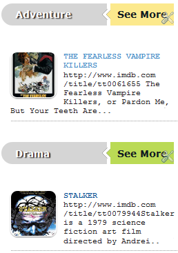
This is another method of using the :after and :before properties and it will work without too many problems in any browser, including IE8. What this trick will do is to divide the header bar into left and right sections, where the left will contain an explanatory title and the right, a related link.
The idea of generating Adobe-like Arrow Headers was actually discussed by css-tricks and adapted to Blogger.
Step 1. Log in to your Blogger dashboard > go to Template > Edit HTML, then click anywhere inside the code area to search - using the CTRL + F keys - for the following tag:
Step 4. Now go to Layout and Add a new HTML/JavaScript Gadget with one of the codes below for each of the widget title:
Background in blue:
Note: Change "Title in" text with your widget's title and Blue, Yellow, Green and Red with the text on the right, then add a Link URL to it.
Step 5. After you saved the HTML/Javascript gadgets containing the codes above, drag and drop them just above the widgets you want to show... and Save the Arrangement.
DEMO
You can see how the sidebar titles has been replaced with some cool header bars on this demo blog.
- Display Blogger Posts In Grid View With Thumbnails
Grid View with Thumbnails is a script for self-hosted Blogger blogs which will display blog posts as a thumbnail grid of images in homepage and archive pages. Instead of sending your blog visitors to a page that displays all the posts in full length with...
- Advanced Random Posts Widget For Blogger With Image Thumbnails And Snippets
When your blog has too many posts, visitors don't always have the time or desire to go through all the posts written there in order to make an idea of the blog's content. Thus, a random posts widget that will allow visitors to find content more...
- Multi Hover Effect On Blogger Images Using Pure Css
Today I'm going to show you how to add an amazing mouseover effect for Blogger images using only CSS, in which moving your mouse over an image from different directions (from above, from below, etc) will cause an overlay transitioned in from the same...
- Add Static Facebook Pop Out Like Box With Smooth Jquery Hover Effect
In this tutorial, I will show you how to add a cool floating Facebook like widget for Blogger that slides to the left on mouseover. Demo: You can see a static Facebook badge on the right side of this blog: Demo blog Adding Static Facebook Like widget...
- Add Css/jquery Fixed Horizontal Menu To Blogger Blog
This navigation bar gets semi-transparent when you scroll down the page and is slightly showing up by fading out and becoming almost transparent. When the user hovers over it, the menu becomes opaque again. Inside of the navigation there are some links,...
Blogger Tips
Using the :before and :after Pseudo Elements on Sidebar Titles
This is another method of using the :after and :before properties and it will work without too many problems in any browser, including IE8. What this trick will do is to divide the header bar into left and right sections, where the left will contain an explanatory title and the right, a related link.
The idea of generating Adobe-like Arrow Headers was actually discussed by css-tricks and adapted to Blogger.
How to Add Adobe-like Headers to Blogger

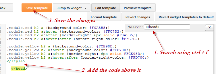
Step 1. Log in to your Blogger dashboard > go to Template > Edit HTML, then click anywhere inside the code area to search - using the CTRL + F keys - for the following tag:
</head>Step 2. Just above it, copy and paste this code:
<style>Step 3. Save the Template.
.module h2 {
background-color: #D5D5D5;
border-radius: 20px 0 0 20px;
color: #FFFFFF;
font-family: Verdana;
font-size: 14px;
line-height: 32px;
margin: 0;
padding: 0 0 0 20px;
text-shadow: 2px 1px 1px #222;
}
.module h2 a {
border-left: 5px solid #ffffff;
color: #101921;
float: right;
font-size: 14px;
text-decoration: none;
text-shadow: none;
padding: 0 10px;
position: relative;
-moz-transition: padding 0.1s linear;
-webkit-transition: padding 0.1s linear;
-ms-transition: padding 0.1s linear;
-o-transition: padding 0.1s linear;
}
.module h2 a:hover {
padding: 0 32px;
}
.module h2 a:before, .module h2 a:after {
content: "";
height: 0;
position: absolute;
top: 50%;
width: 0;
}
.module h2 a:before {
border-bottom: 8px solid transparent;
border-right: 8px solid #ffffff;
border-top: 8px solid transparent;
left: -12px;
margin-top: -8px;
}
.module h2 a:after {
border-bottom: 6px solid transparent;
border-top: 6px solid transparent;
left: -6px;
margin-top: -6px;
}
.module.blue h2 a {background-color: #A2D5EC;}
.module.blue h2 a:hover {background-color: #C5F0FF;}
.module.blue h2 a:after {border-right: 6px solid #A2D5EC;}
.module.blue h2 a:hover:after {border-right-color: #C5F0FF;}
.module.yellow h2 a {background-color: #FCE98D;}
.module.yellow h2 a:hover {background-color: #FFD700;}
.module.yellow h2 a:after {border-right: 6px solid #FCE98D;}
.module.yellow h2 a:hover:after {border-right-color: #FFD700;}
.module.green h2 a {background-color: #bada55;}
.module.green h2 a:hover {background: #C7E176;}
.module.green h2 a:after {border-right: 6px solid #bada55;}
.module.green h2 a:hover:after {border-right-color: #C7E176;}
.module.red h2 a {background-color: #F0A5B5;}
.module.red h2 a:hover {background-color: #FFC7D2;}
.module.red h2 a:after {border-right: 6px solid #F0A5B5;}
.module.red h2 a:hover:after {border-right-color: #FFC7D2;}
</style>
Screenshot:

Step 4. Now go to Layout and Add a new HTML/JavaScript Gadget with one of the codes below for each of the widget title:
Background in blue:
<div class="module blue">Background in yellow:
<h2>Title in <a href="Link URL">Blue</a></h2>
</div>
<div class="module yellow">Background in green:
<h2>Title in <a href="Link URL">Yellow</a></h2>
</div>
<div class="module green">Background in red:
<h2>Title in <a href="Link URL">Green</a></h2>
</div>
<div class="module red">
<h2>Title in <a href="Link URL">Red</a></h2>
</div>
Note: Change "Title in" text with your widget's title and Blue, Yellow, Green and Red with the text on the right, then add a Link URL to it.
Step 5. After you saved the HTML/Javascript gadgets containing the codes above, drag and drop them just above the widgets you want to show... and Save the Arrangement.

DEMO
You can see how the sidebar titles has been replaced with some cool header bars on this demo blog.
- Display Blogger Posts In Grid View With Thumbnails
Grid View with Thumbnails is a script for self-hosted Blogger blogs which will display blog posts as a thumbnail grid of images in homepage and archive pages. Instead of sending your blog visitors to a page that displays all the posts in full length with...
- Advanced Random Posts Widget For Blogger With Image Thumbnails And Snippets
When your blog has too many posts, visitors don't always have the time or desire to go through all the posts written there in order to make an idea of the blog's content. Thus, a random posts widget that will allow visitors to find content more...
- Multi Hover Effect On Blogger Images Using Pure Css
Today I'm going to show you how to add an amazing mouseover effect for Blogger images using only CSS, in which moving your mouse over an image from different directions (from above, from below, etc) will cause an overlay transitioned in from the same...
- Add Static Facebook Pop Out Like Box With Smooth Jquery Hover Effect
In this tutorial, I will show you how to add a cool floating Facebook like widget for Blogger that slides to the left on mouseover. Demo: You can see a static Facebook badge on the right side of this blog: Demo blog Adding Static Facebook Like widget...
- Add Css/jquery Fixed Horizontal Menu To Blogger Blog
This navigation bar gets semi-transparent when you scroll down the page and is slightly showing up by fading out and becoming almost transparent. When the user hovers over it, the menu becomes opaque again. Inside of the navigation there are some links,...
