Blogger Tips
Here are some unique border styles that you can apply to blogger images by using the border-radius property and defining either all four corners simultaneously or applying the rounded border only to some of them.
One of the advantages of CSS3 is that we can apply rounded borders without complicating things too much and one of the options would be to use these edges or borders to images in the blog posts, to which we can also add some hover effects such as shading and rounded borders accompanied by transitions.
Note: if you need more info about how to add rounded corners on images, follow these links:
- CSS Basics. How to Apply Rounded Corners On Images #1
- CSS Basics. How to Apply Rounded Corners On Images #2
Below are a few examples of these borders and how the images behave when you hover over them.
If you want to use one of these styles, just copy the code below the image, then go to Template, click on the Edit HTML button and paste that code before ]]></b:skin> (CTRL + F to find it)
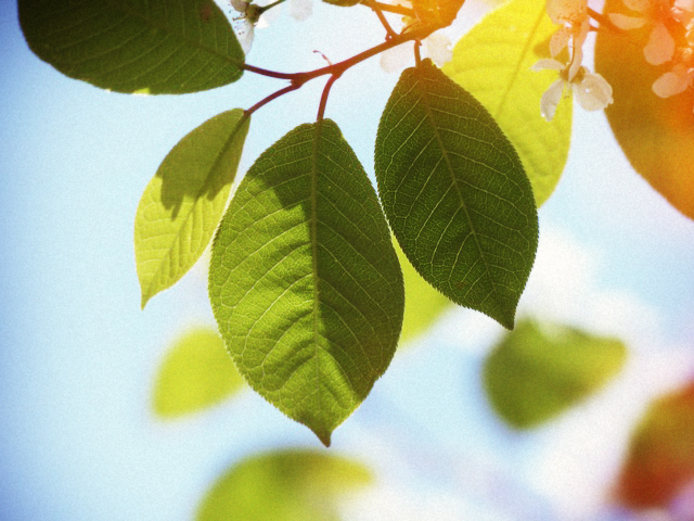


- Add A Css Animated Share Button On Blogger
I saw this on Paulund, a highly recommended site with a good collection of snippets, i.e., a collection of different codes that develop small utilities, all of these being applicable to web design. In this tutorial we will see how we can add as similar...
- Create A Css3 Image Hover Effect With Animated Vinyl Record
Here is an amazing CSS image effect to reveal more information on your images with a really cool CSS3 hover animation. This is just perfect for blogs dedicated to music or if you just want to show off the music that you love. So, what we will do in this...
- Create A Css Image Slider With Thumbnails For Blogger
Image galleries/sliders are particularly useful for photoblogs, but they could also serve those who occasionally need a gadget like this. As we have seen in a previous tutorial, on the top of the main thumbnail, we have had some smaller thumbnails which...
- Popular Posts Widget For Christmas
The Christmas countdown has begun and while homes are decorated with colorful lights and the sweet smell of pine trees, there's no reason why we wouldn't decorate our Blogspot blog with Christmas bells next to the Popular Posts widget for Blogger!...
- How To Add A Vintage Style To Images In Blogger Using Css
To get that vintage Instagram effect on your pictures, you don't have to use a program, now you can use CSS and get a similar result! The following trick will apply a shadow inside the image, add a back border, and on top of the image, add another...
Blogger Tips
Rounded Corners and Shadows for Images using CSS
Here are some unique border styles that you can apply to blogger images by using the border-radius property and defining either all four corners simultaneously or applying the rounded border only to some of them.

One of the advantages of CSS3 is that we can apply rounded borders without complicating things too much and one of the options would be to use these edges or borders to images in the blog posts, to which we can also add some hover effects such as shading and rounded borders accompanied by transitions.
Note: if you need more info about how to add rounded corners on images, follow these links:
- CSS Basics. How to Apply Rounded Corners On Images #1
- CSS Basics. How to Apply Rounded Corners On Images #2
Below are a few examples of these borders and how the images behave when you hover over them.
If you want to use one of these styles, just copy the code below the image, then go to Template, click on the Edit HTML button and paste that code before ]]></b:skin> (CTRL + F to find it)

.post-body img {
border:0;
padding:0;
-moz-transition: all 1s;
-webkit-transition: all 1s;
-o-transition: all 1s;
}
.post-body img:hover {
box-shadow: 0px 0px 15px #000; /* Shadow */
border-radius: 50%; /* Rounded border */
-moz-transition: all 1s;
-webkit-transition: all 1s;
-o-transition: all 1s;
cursor:pointer;
}

.post-body img {
background:#FFF; /* background color around the image */
padding:15px; /* space between border and image */
-moz-transition: all 1s;
-webkit-transition: all 1s;
-o-transition: all 1s;
}
.post-body img:hover {
box-shadow: 0px 0px 15px #000; /* Shadow */
border-radius: 0% 50%; /* Rounded border */
-moz-transition: all 1s;
-webkit-transition: all 1s;
-o-transition: all 1s;
cursor:pointer;
}

.post-body img {
background:#FFF; /* the background color around the image */
padding:15px; /* The Space Between Border and Image */
border-radius: 50% 0; /* Rounded border */
box-shadow: 0px 0px 15px #000; /* Shadow */
-moz-transition: all 1s;
-webkit-transition: all 1s;
-o-transition: all 1s;
}
.post-body img:hover {
border-radius:0; /* This removes the border roundness (value 0) */
-moz-transition: all 1s;
-webkit-transition: all 1s;
-o-transition: all 1s;
cursor:pointer;
}

.post-body img {
box-shadow: 0px 0px 15px #000; /* Shadow */
border-radius: 50%; /* Rounded border */
border:0;
padding:0;
-moz-transition: all 1s;
-webkit-transition: all 1s;
-o-transition: all 1s;
}
.post-body img:hover {
box-shadow: 0; /* With this we remove the shadow (value 0) */
border-radius: 0; /* This removes the border roundness (value 0) */
-moz-transition: all 1s;
-webkit-transition: all 1s;
-o-transition: all 1s;
cursor:pointer;
}

.post-body img {So these effects will apply to all images uploaded to your Blogger posts. But if you want to apply them only on certain pictures then change .post-body img with .rounded and .post-body img:hover with .rounded:hoverThen add the rounded class selector in the image's code:
border-radius: 45% / 20%; /* Rounded border */
box-shadow: 0px 0px 15px #000; /* Shadow */
padding:0;
-moz-transition: all 1s;
-webkit-transition: all 1s;
-o-transition: all 1s;
}
.post-body img:hover {
border-radius: 0; /* This removes the roundness of border (value 0) */
-moz-transition: all 1s;
-webkit-transition: all 1s;
-o-transition: all 1s;
cursor:pointer;
}
<img class="rounded" src="Image URL"/>These are just some examples, however, you can modify them anytime by adding or deleting more CSS styles, it depends on everybody's tastes or needs. But as you have seen, we can make the images look way more attractive and this has been done only with CSS ;)
- Add A Css Animated Share Button On Blogger
I saw this on Paulund, a highly recommended site with a good collection of snippets, i.e., a collection of different codes that develop small utilities, all of these being applicable to web design. In this tutorial we will see how we can add as similar...
- Create A Css3 Image Hover Effect With Animated Vinyl Record
Here is an amazing CSS image effect to reveal more information on your images with a really cool CSS3 hover animation. This is just perfect for blogs dedicated to music or if you just want to show off the music that you love. So, what we will do in this...
- Create A Css Image Slider With Thumbnails For Blogger
Image galleries/sliders are particularly useful for photoblogs, but they could also serve those who occasionally need a gadget like this. As we have seen in a previous tutorial, on the top of the main thumbnail, we have had some smaller thumbnails which...
- Popular Posts Widget For Christmas
The Christmas countdown has begun and while homes are decorated with colorful lights and the sweet smell of pine trees, there's no reason why we wouldn't decorate our Blogspot blog with Christmas bells next to the Popular Posts widget for Blogger!...
- How To Add A Vintage Style To Images In Blogger Using Css
To get that vintage Instagram effect on your pictures, you don't have to use a program, now you can use CSS and get a similar result! The following trick will apply a shadow inside the image, add a back border, and on top of the image, add another...
